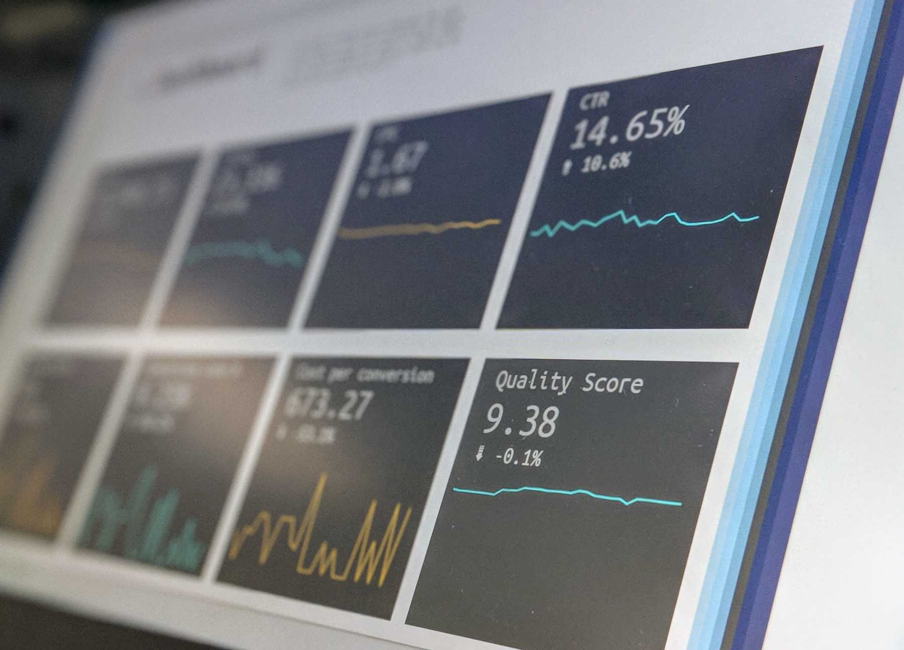
Creating Dashboard to Visualise Data In Python
📅 November 24, 2019
•⏱️3 min read
Introduction
During one of my university project modules which require us to present our data from the sample dataset of the Scottish Referendum 2014.
There I was exposed to terms like Data Wrangling and the use of D3 to create an interactive dashboard.
Which the process to do data-wrangling was a tedious process and creating the dashboard using D3 was quite bad as well.
So Data Visualisation always leaves a bad taste for me.
Pain in Building Dashboard
For me, the difficulty arises when building a website dashboard in Python.
Despite there are literally tons of dashboard templates out there. From bootstrap, D3 to plotly chart templates to get you started.
When you want to customise it to fit your need, It can be a huge learning curve.
Especially your focus is not on web development. With the ever-growing amount of front-end technologies at your disposal. It can be daunting for anyone.
If you are like most developers with skillsets to analyse the data and presenting a story out of it.
This is where I believe that using data visualisation libraries can help to speed up the creation process of your dashboard to present data.
Data Visualisation Libraries for Dashboard
Till date, I had played with two data visualisation libraries for creating a dashboard in Python.
Namely, Dash by Plotly which has quite a mature data visualisation library & beautiful interactive charts .
But it has a steeper learning curve and a lot of boilerplate code.
When you are creating your own dashboard using the HTML components provided by Plotly.
The 2nd that I had worked with is a new kid on the block that is called Streamlit.
Which offers features like 3rd party integration of charts and data caching capabilities along with the use of markdown to create your dashboard.
Conclusion
Despite the ease of use for these dashboards libraries, which helps you to create a dashboard without the need to learn or built using front-end web technologies.
I found out that this does not replace the need for data analysis or data visualisation using plotting libraries like Bokeh, Plotly or Matplotlib.
Since I was stuck with cleaning and generating the charts needed to display it on my dashboard.
Never the less, If you are planning to build a website dashboard.
I would strongly recommend you to start with Streamlit due to its simplicity and ease of us to get started. You can go the Streamlit video tutorial to learn about how to use it in just under 4 mins.